
We have been hard at work completing a redesign of the Impact DashBoard platform and adding new features. Here’s a detailed explanation of what you’ll find in the new update, or scroll down to the bottom of the page and view the video demonstration.
New Design & Features:
- New Navigation Menu
- New Project Categories
- Project Tile View or List View
- Project Tags
- Project Control Center
- Scenario Workspace
- Scenario Info
- Public Support
- Report
- Settings/Assumptions
- My Account
New Navigation Menu & Project Categories
The new navigation menu located on the left side of the screen allows users to easily access Project Categories (Active, Won, Lost, Archived, or All), jump to recently viewed projects, access their “My Account” page, or Sign Out. The navigation collapses when not in use in order to maximize screen space. Simply move your cursor over the gray navigation strip on the left of the page to access the navigation menu.
Project Tile or List View
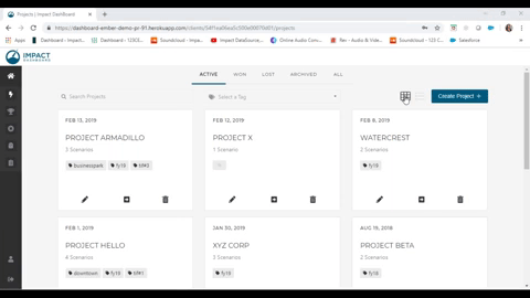
Based on your preference, view your projects in either a Tile or List view. To change views, use the icons at the top right of the Projects page next to the “Create Project” button. Both options allow users to view the Project name, number of scenarios, tags, and the date you last edited the project.
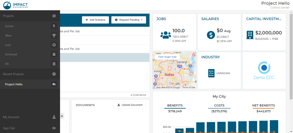
Project Control Center
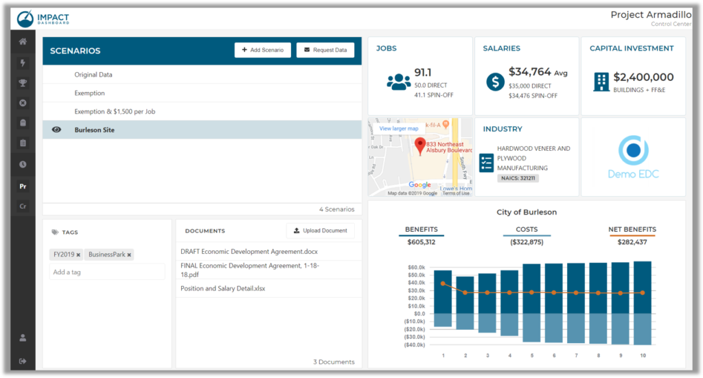
One of the most exciting new pages in the redesign is the Project Control Center. After clicking on a Project you’ll see the Project Control Center where users can view a list of scenarios created for a project, review/add/remove Project tags and upload/download/remove Project documents.
Users can add a new scenario, send data requests, edit/copy/delete scenarios all from the Project Control Center.
The Project Control Center also allows users to preview scenario information and results by clicking on the Preview icon to the left of the scenario name. The preview data on the right side of the Control Center updates to reveal information and results for a selected scenario.
Scenario Workspace Redesign
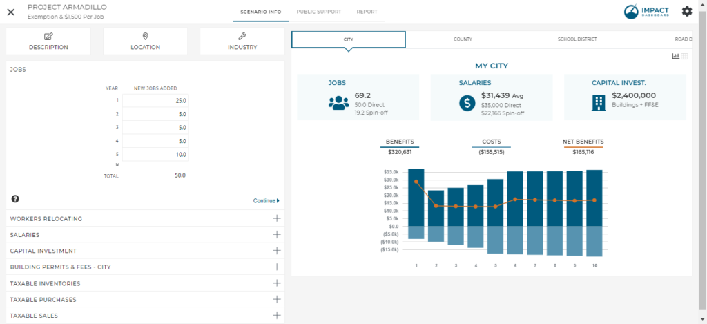
The Scenario Workspace is similar to previous versions of the app but has been redesigned for ease of use. The Scenario Info page of the Scenario Workspace includes all of the project-specific inputs required for the analysis on the left side and a dashboard of results on the right side. Users can view the impact on any of the tax district included in the model in the redesigned dashboard.
Longtime model users will notice the General Info pop-up modal in previous versions has been broken up into three parts as seen at the top left of the screenshot: Description, Location, and Industry.
Description – Users can name the scenario and provide a summary of the analysis that will be included the in Detailed Report
Location – Users can identify the specific tax districts to be included in the analysis and enter an address for the project.
Industry – Users can identify a NAICS code for the scenario which will pull in the appropriate economic impact multipliers. Users also have the ability to overwrite the inputs with custom multipliers.
Public Support
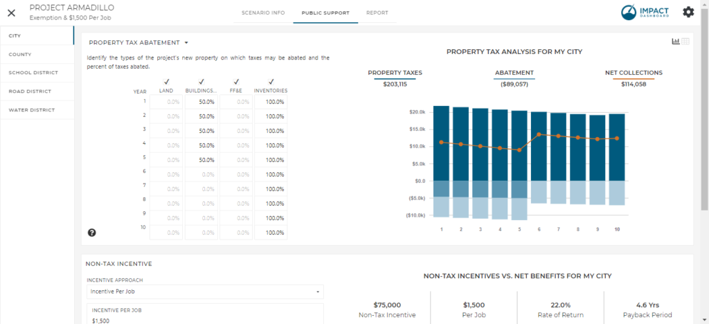
The Public Support page of the Scenario Workspace has been modified to all users to specify the type of property tax or sales tax incentive. Options include “Tax Abatement”, “Tax Exemption”, and “Tax Rebate” and can be modified by clicking on the section heading. The analysis is identical for each option but the labels throughout the analysis will speak your specific plans.
Users can model Public Support for any tax district
included in the model. Use the new navigation menu on the left side of the Public Support page to select the desired tax district to apply various types of economic development incentives.
Reports
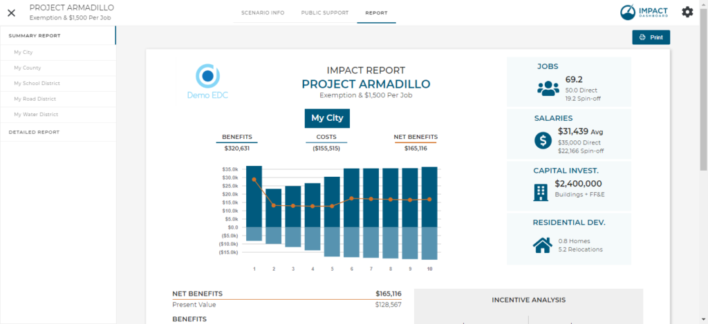
The new report page layout includes a navigation menu on the left that allows users to choose whether they’d like to view the Summary Report or Detailed Report. Further, users can choose to view a Summary Report for any taxing district included in the analysis. The reports have a new look, as well! View samples of the redesigned reports here:
My Account
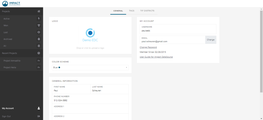
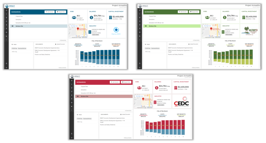
Access your My Account page by clicking on the link at the bottom of the Navigation Menu. On your My Account page, access your userguide, update or change your contact information, and specify a color scheme for your Impact DashBoard experience. The default color scheme is Blue but other color options include a Green or Red. Choose a color that compliments your logo – the color scheme will re-brand the entire app with your selected highlight color – including the reports. See screenshots of the various color schemes below.
From the My Account page, click on the Tags page to view and edit existing tags and see which projects are associated with each tag. Click on TIF Districts to create or edit a Tax Increment Financing District profiles.